Overall, the branding process was an enjoyable challenge. The product objectives, user needs, success metrics, and user analysis helped me develop a tone of voice, select meaningful colors, and typography. I used the website coolors.com to help me pick colors and visualize how they work together in the platform’s dynamic layout.
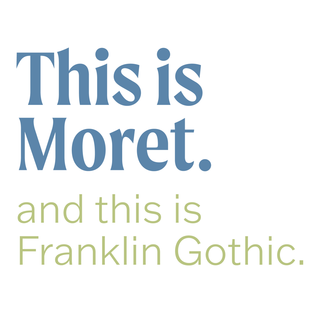
I decided on Moret as the header typeface because it has a lot of contrast in the stroke and is eye-catching. It is hard to read at small sizes, so it will only be used for large headers. The body copy is Franklin Gothic ATF because it is easy to read and contrasts nicely with Moret. It also comes in various weights, which can be used for smaller subheads where Moret may not work.
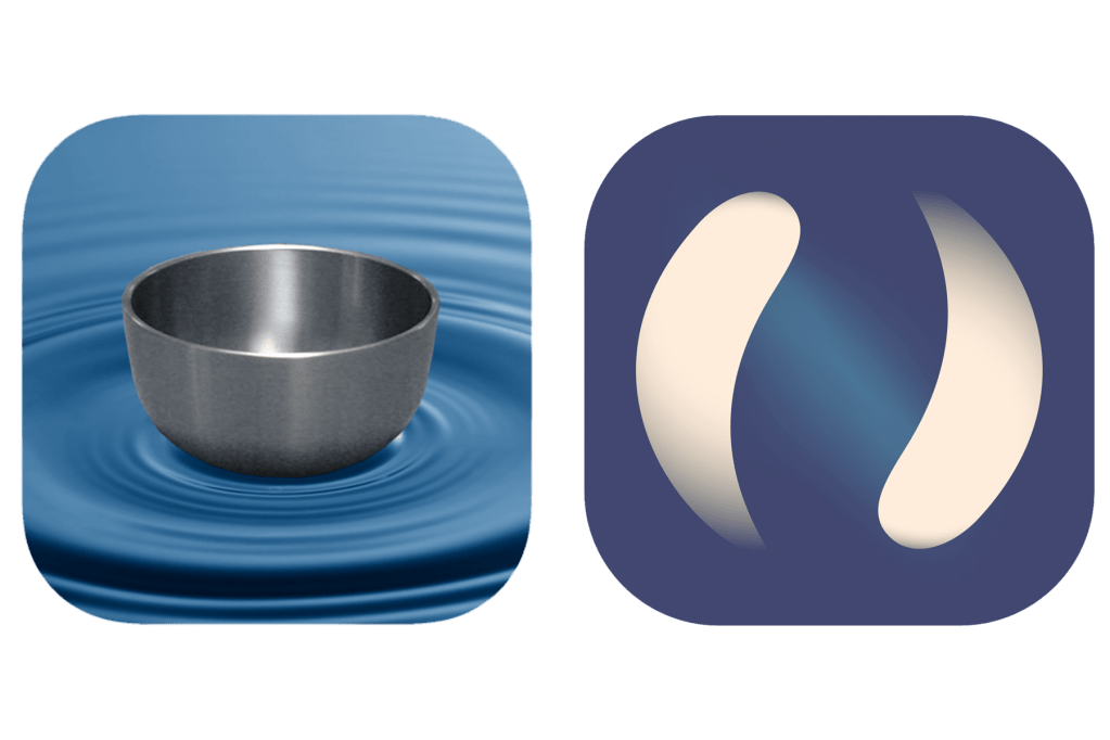
The most challenging part of redesigning the branding was the logo. Many apps use abstract circle shapes or singing bowls as their logo. I ultimately decided to rename the app to Namaste rather than Mindfulness Bell because it has a more straightforward message and allows for more app logos and overall branding opportunities.
The word Namaste translates to mean “I bow to you,” but when I was a child, I learned it as “the light within me honors the light within you.” This gave me the idea to present the light within us all in the app logo. I prefer this name because it reminds the user of the eastern origin of meditation rather than the westernized version that has been popularized.
Before I came to the final design for the logo, I experimented with the different ways I could potentially make it come to life. I wanted to design something that showed two light sources following each other in a circle, one representing the app and one representing the user (both relying on and honoring the light within each other). I initially wanted the light to be very soft, blending into the background, but I could not get any of the tools in Illustrator (gradient map or mesh tool) to make the shape defined enough.
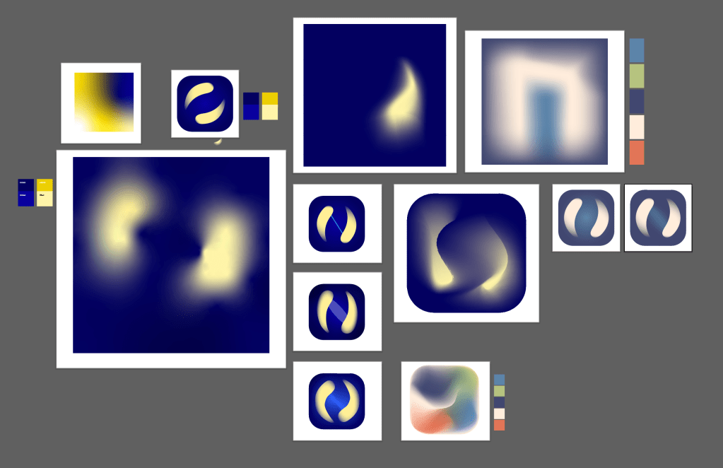
I drew a shape with the pen tool and used the radial gradient tool to make the colors softer. Some of the edges are close enough to the edge of the radial gradient that they fade into the background like I had hoped, while others are much harder. While it isn’t exactly as I had hoped, it came out well and is more effective than the previous logo.