One of the most important parts of developing or redesigning an app is having a sound information architecture to work from. In The Elements of User Experience, Jesse James Garrett defines information architecture as being “concerned with how people cognitively process information” and says it comes up “in any product that requires users to make sense of the information presented.” Defining the information architecture helps you break down the main functions of the app. Once those are identified, you can arrange and rearrange them based on how the topics relate. Understanding these connections will help both you, the designer, make sure the app stays on track as it is developed. It will also help the user in the end because the information will likely be laid out in a more logical way.
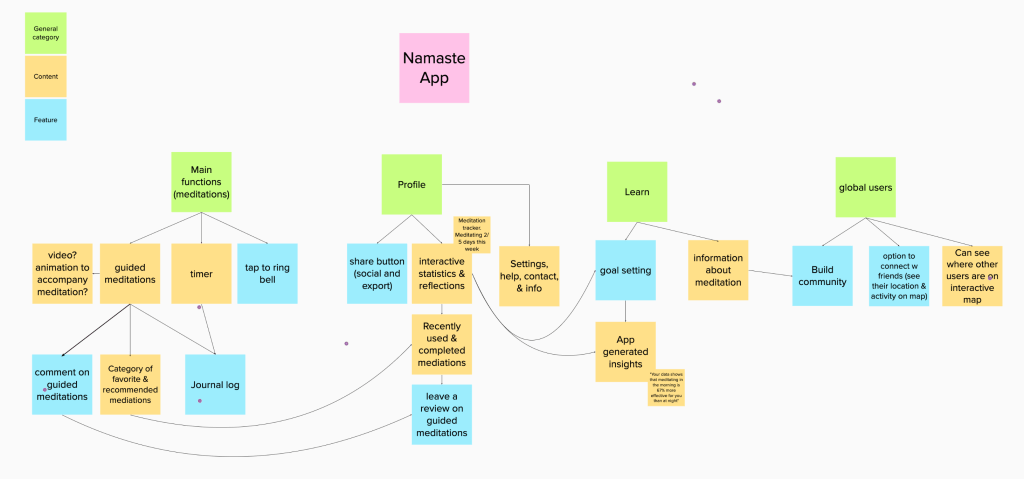
I began by breaking down Namaste into four main categories: meditation, profile, learn, and global users. All the functions the app will have can fit into one of these categories which helped me know I was on the right track. I then began filling in each category with details like specific content and features.

One of the most challenging parts of this step was distinguishing which elements were content and which were features. I was able to distinguish them best by thinking of content as something produced by the app and features as something that is only beneficial if the user does something to interact with it such as leaving a rating. There are also a lot of opportunities for content and features to relate and link to each other which made showing connections complicated.
Laying out the categories visually in a flow helped me understand which were most closely related. When I started arranging it and drawing connections, I realized that many of the features would function better in different categories and that I didn’t need as many complex connections as I started with. When I began rearranging the content, I realized that overlapping lines often indicated that I needed to alter the structure. When I did this, the structure made more sense, and the purpose became more transparent.
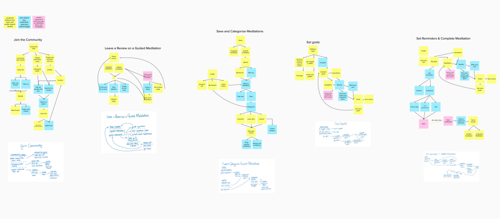
Once the information architecture was established, I began thinking about user flows. First, I set goals which described specific tasks I want the users to complete such as rating a guided meditation. I ideated ten and then chose five to sketch into user flows. Those five were:
- Leave a review on a guided meditation
- Set goals
- Join the community
- Set reminders and complete a meditation
- Save and categorize guided meditation
Sketching user flows was much easier with the foundation of the information architecture to guide the concepts. Drawing the flows before making the final structures made it a lot easier to rearrange the order of actions and screens that the user will go through. In my sketches, I used shorthand for user design flows. This method made them faster to make and easier to understand when viewed by other designers.

Once my sketches were completed, I translated them into flows using Jesse James Garret’s visual vocabulary which identifies symbols and strategies to express different elements in a flow. I primarily utilized colors each of which I identified in a key. Yellow represents content, blue represents user actions, and pink represents product responses and errors. Most of the flows were loops that brought allowed the user to repeat the action. If the action was not a loop, it brought the user to the home screen where they could decide what they do next.
