When you talk to a graphic designer about the words that appear in their design, you’ll most likely hear them refer to the typeface. If you talk to almost anyone else about words they’re putting on a page, they’re more likely to call their appearance the font. The world font is more widely used but isn’t the correct word for the context most of the time.
History
Fonts and typefaces didn’t exist until the Middle Ages, when Johannes Gutenberg invented movable type and the printing press. Before that, all content was hand-copied from an original manuscript. When people produced books this way, they were far more expensive and less accessible.
The printing press made books and texts easier to reproduce and, arguably, easier to read. With it came a variety of typefaces and approaches to design.
The Difference
A typeface consists of characters such as letters, numbers, and symbols of the same design. Examples of typefaces include Calibri (the default on Microsoft Word), Franklin Gothic, and Avenir. A font refers to variations within a typeface. This variation includes elements like point size and weight.
Typefaces
Choose your typefaces carefully because they can make or break your text. Typefaces with extreme variation in stroke, such as Bodoni, can be very difficult to read at smaller sizes. If you’re just entering the world of typography, I recommend sticking to the following twenty typefaces;
- Avenir
- Baskerville
- Bodoni
- Caslon
- Century Gothic
- Didot
- Franklin Gothic
- Frutiger
- Futura
- Garamond
- Gill Sans
- Goudy Old Style
- Helvetica
- Minion
- Myriad Pro
- Officina
- Optima
- Rockwell
- Trade Gothic
- Univers
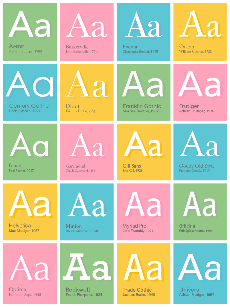
Working exclusively with these typefaces will both improve your overall typography skills and help you learn the importance of fonts. Choosing the appropriate typeface for a context makes the design effective and visually attractive.
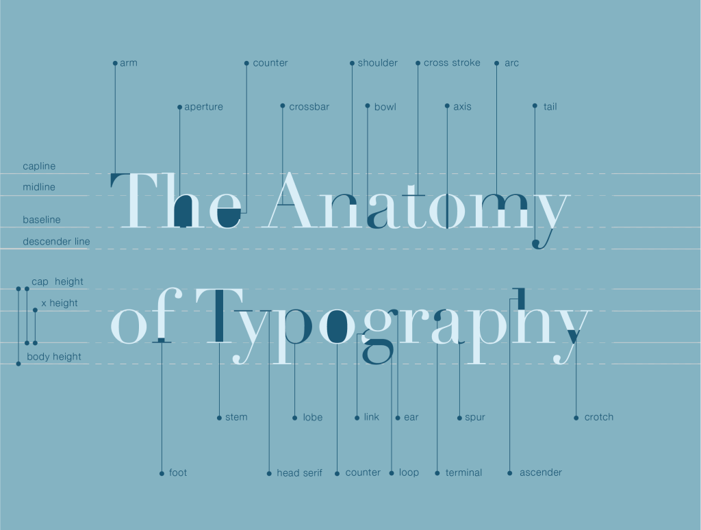
While there are several identifiers for typefaces, the most common is the presence or lack of serifs. Serifs are the little lines or appendages that hang off of the ends of some characters. Typefaces with serifs fall into the category of “serifs,” and typefaces without them fall into the “sans serifs” category.
While there is no correct or incorrect instance to use either family, there are some instances where one is more expected than the other. For example, the body copy of newspapers and books is often a serif typeface, while websites and other digital texts use sans serifs. Serif typefaces have origins in calligraphy and are associated with a more classic style. They lend themselves to newspapers because, in the age of technology, newspapers are often thought of as a relic of the past. Likewise, digital content is a modern medium, so serif typefaces are more commonly used in that context.
Fonts
Once you have decided on a typeface, you can use fonts to support hierarchy and guide the reader in finding what they are looking for. For example, headlines are often a larger point size and bold. Both variables are fonts that are applied to the typeface. Some typefaces have options for fonts such as light, regular, italic, bold, heavy, and more, while others may come in only one weight. Choosing a typeface that comes with more weights often makes creating hierarchy easier.
Why It Matters
While the difference between a font and a typeface may not matter to most people, it is an essential distinguishing factor for designers. Choose your typefaces with precision, your fonts with care, and remember that typography can make or break a design.
