Color can make or break a design. When colors work well, we hardly notice them, but they become distracting and disruptive when applied poorly. Understanding color theory allows designers to use color more successfully and, therefore, make more effective work.
Color is broken down into three main categories: primary, secondary, and tertiary. The primary colors are red, blue, and yellow, and you can make all other colors by combining them in different ways. Secondary colors are a mix of the primary colors (red + blue, red + yellow, blue + yellow). Tertiary colors, also called intermediate colors, are a mix of primary and secondary colors.
Hue, saturation, and value are crucial to understanding the nuances of color. The hue is the specific name of a color. Think of a box of crayons and how each one has a name. An example of a hue is fire engine red. Saturation is the intensity of a color. When a color is more subtle, it is less saturated, and when it is more vibrant, it is more saturated. Value is the lightness or darkness of a color and is determined by how much white or black is added to it.
Breaking color down in this way is called creating a color space. In graphic design, the color space you work in depends on what you are making. For example, if you are designing something for print, you will work in CMYK (cyan, magenta, yellow, and black), but if you create something digitally, you will work in RGB (red, blue, green). The different displays have to do with how we see color and how it is displayed.
When we see color on a physical object like a poster, we really see reflected wavelengths. Objects absorb some colors, so we don’t see them, and what is not absorbed is what we see. Digital color is produced differently. Our screens make the color, and the light brings it to our eyes. This fundamental difference is why print uses CMYK and digital uses RGB.
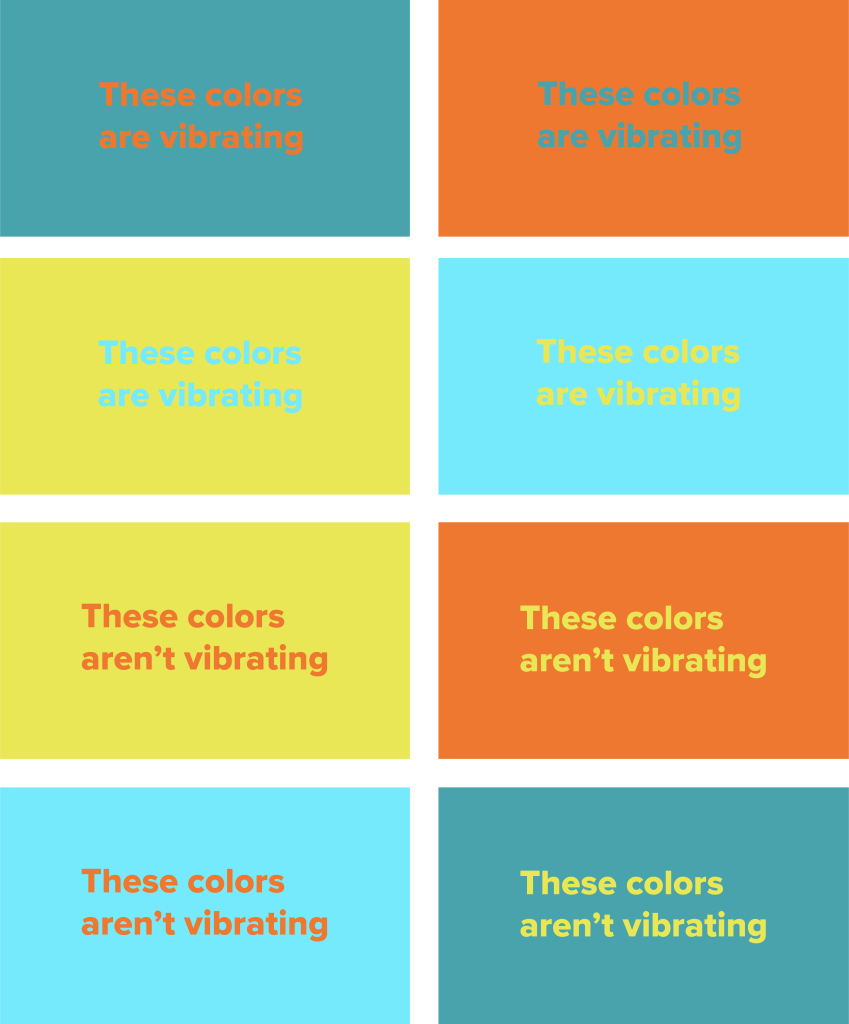
Beginner designers often struggle with vibration when choosing colors. Vibration occurs when two highly saturated colors are next to each other and appear to blur, glow, merge, or have the illusion of motion. While this may sound like an interesting phenomenon, it often makes work difficult, if not impossible, to see which negates the design. You can eliminate vibration by using different colors or adjusting the existing colors’ hue, saturation, or value.
Color is also closely tied to emotion. Breaking convention with color in design can confuse the user and create an unpleasant experience. For example, red is often associated with danger or error messages. If you are designing an app or website and making an agreement button red, the user may assume it is a cancel button. Red could be used more effectively in creating a Valentine’s Day card because it is also associated with love and passion.
Color can also guide essential elements of design, such as contrast and hierarchy. Contrast is significant because it ensures that features will be easy to see. Contrast is also vital for people with visual impairments like colorblindness or limited vision. When colors are too similar, the content gets lost, and the material becomes inaccessible. Color can also guide hierarchy because our eye is drawn to bright colors. Using more vibrant colors for headlines makes them more apparent, and using duller colors for body copy helps it blend in while also making it easier to look at.
Creating a color palette can be difficult, but many websites can help you. Coolors.co is a color palette generator that lets you flip through colors quickly. When you see colors you like, you can lock them into place. Adobe color is another helpful site because it is incredibly versatile. You can create your own palettes, browse other people’s color palettes, or view trends to get inspiration. The best part about Adobe color is that if you work with other Adobe products, you can add the palettes to your library and see them in your apps. Huemint is another color generator and is by far my favorite option. It generates colors and shows them in various configurations so you can see how they interact with each other. It even includes product mockups so you can get an idea of how the colors will interact with each other in a physical context.
Now you know the basics of color – make something!
