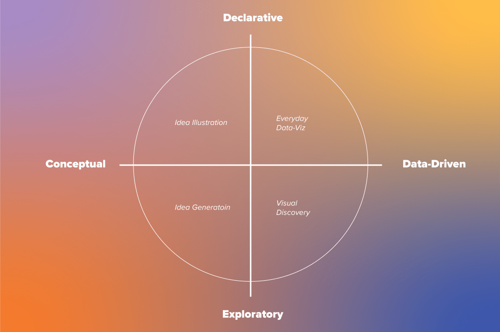
Before effectively visualizing data, it is vital to understand the different kinds and purposes. There are four broad categories: declarative, exploratory, conceptual, and data-driven. Generally, data will fall into two of the four: declarative or exploratory and conceptual or data-driven. So, what do these characteristics mean?
Declarative vs. exploratory
Declarative data is most frequently used to document information. In his book Good Charts, Scott Berinato explains, “if you have a spreadsheet workbook full of sales data and you’re using that data to show quarterly sales or sales by region in a presentation – your purpose is declarative.” Essentially, declarative data reflects known information and serves a specific purpose.
Berinato describes exploratory data as “rougher… in design, usually iterative, [and] sometimes interactive.” Exploratory data is useful when you do not know exactly what you are looking for or if you want to discover something new. It lends itself best to more complex inquiries that compare variables such as the relationship between sales success and the time of year.
Conceptual vs. data-driven
Conceptual data is my favorite kind because it focuses on ideas. It does not use data that can be plotted, but it visualizes a concept such as steps in a process. Data-driven visualizations require numbers to be reflected in their final form.
These concepts can be applied to the information the data represents and the chart used to express it. Because of this, it is essential to understand that conceptual information can be displayed in a data-driven chart and vice versa.
Conceptual-declarative
Conceptual-declarative visualizations represent ideas that serve a specific purpose. These formats are standard for explaining processes in ways that make them easier to understand and remember. As a graphic designer, my favorite example is the classic Design Thinking Process diagram from the Interaction Design Foundation.
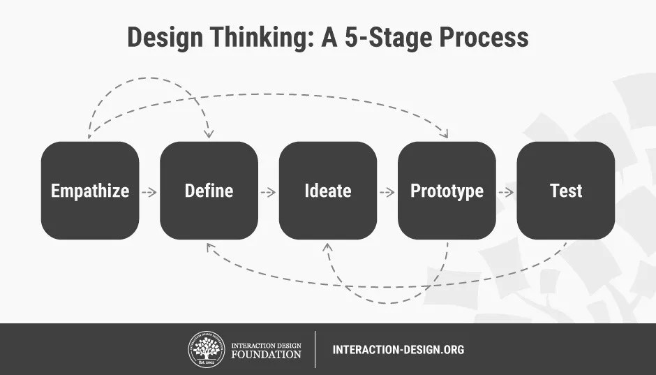
This visualization shows each step in the design thinking process and how the phases are connected. It’s simple and to the point, making it highly effective.
Conceptual-exploratory
Conceptual-exploratory visualizations are the most abstract of the four different kinds. They are most commonly thought of as the iconic scribbles on the back of napkins but exist in many forms. I use them frequently to explore design processes such as user flows or information architecture.
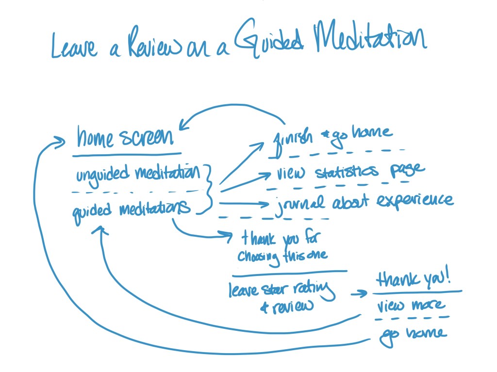
Having a rough sketch like this helps me see the process and understand the different ways that it can take place. Conceptual-exploratory visualization is widely popular because it takes minimal time to create but can yield tremendous results.
Data-driven-declarative
Data-driven declarative visualizations have a specific and unwavering point to make. These are the charts and graphs we are accustomed to seeing, but they can also take more exciting forms. It’s important to remember that these categories apply to what the data represents and not necessarily how it is expressed.
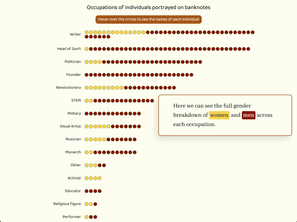
This example from pudding.cool explains the people on bank notes. This visualization is interactive and changes to reflect information, a trait typical of exploratory representations. But the screen capture above shows the professions of people (by the number of circles) and their gender (yellow for women, red for men).
Data-driven-exploratory
Data-driven-exploratory visualization use documented data to explore different aspects of something. This method is most frequently used when you don’t know exactly what you want the data to reflect but have measurable points of information. David McCandless’ supplement viz “Snake Oil Supplements?” is an excellent example.
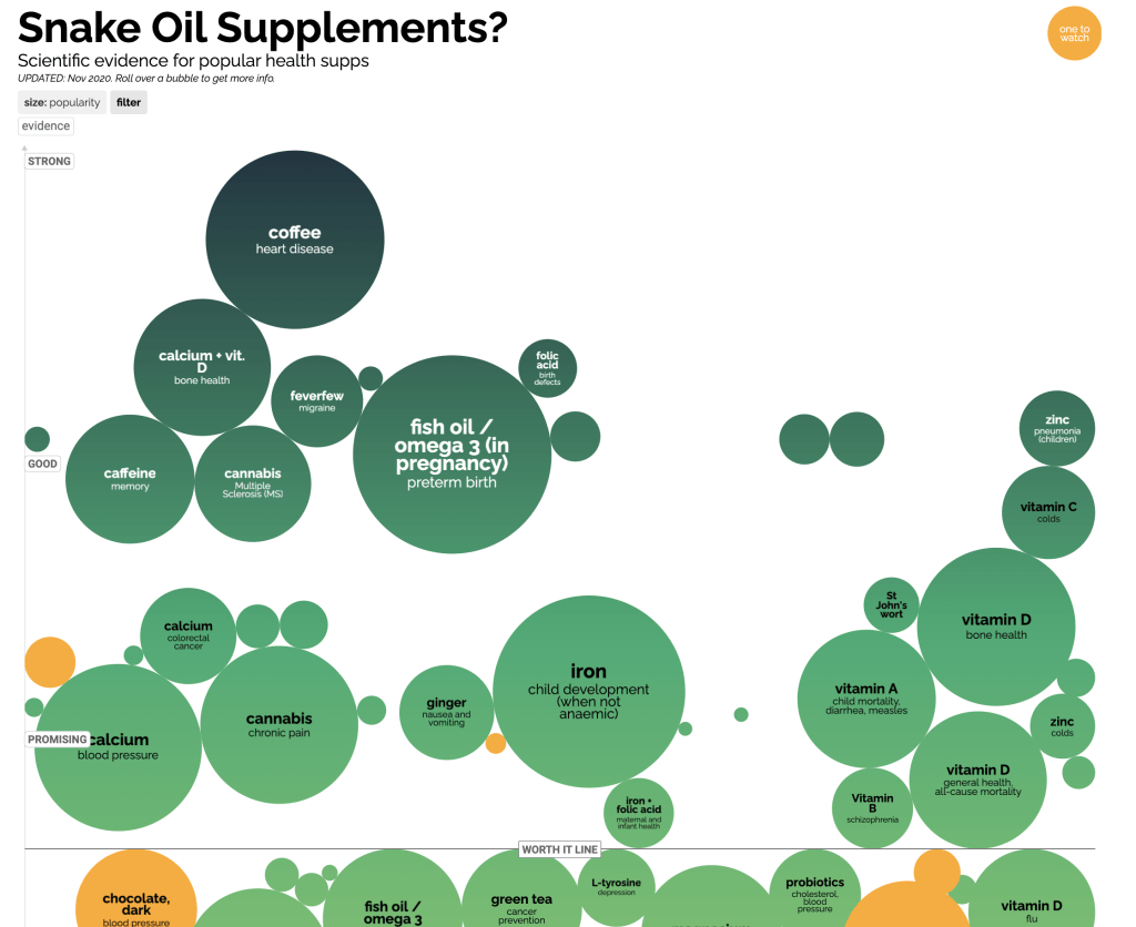
This visualization takes data about how beneficial supplements are, and lets users adjust the filters to see different information.
The different kinds of data serve unique and vital purposes. Understanding why they are different is the first step to creating compelling visualizations.
