When data is visualized, it can tell exciting stories, but what happens when it isn’t visualized well? The visualization process starts with choosing the best format to display the data. This complex task is made even more complicated when working with geographical data because not all maps are created equal.
Because the earth is a globe, it does not lend itself to being depicted in two dimensions. Alberto Cairo aptly describes the process of map-making, saying, “imagine trying to wrap the peel of an orange over a flat surface without tearing it. That’s similar to what we need to do when we create a map.”
To create maps, cartographers make projections. Mark Monmonier explains that map projections “transform the curved, three-dimensional surface of the planet into a flat, two-dimensional plane.”
Maps are generally categorized in two scales: large scale and small scale. Cairo explains that “the scale is a measure of the proportion between distances and sizes on the map and those on the area represented – that is, how big is the map compared to reality?” Large-scale maps show smaller areas because the proportions result in a more significant number (for example, 1:1,000), and small-scale maps show larger areas because the proportions result in smaller numbers (1:1,000,000).
Large scale maps are more accurate than small scale maps because they show a smaller area. The smaller the area, the less curvature of the earth there is to account for, resulting in minimal distortion.
I put maps to the test when making a chart exploring rough sleeping in England. I used a large-scale map for multiple reasons. One of the primary influences on my decision was the data I worked with. Despite the title being “Rough Sleeping Snapshot in England,” the data only reflected the 32 boroughs of Greater London and the city of London. As a result, I did not need to include a map of all of England – only greater London.
Reducing the map to only the Greater London area has two primary benefits; it makes the areas with data easier to identify and interpret and reduces distortion. The drawback of this map is that it may not be immediately recognizable to people unfamiliar with greater London. I, for example, am an American with limited geography skills and would have to rely on the title to tell the area this map represented.
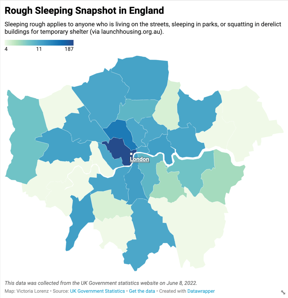
I used a choropleth map to express the data. Alberto Cairo defines a choropleth map as one that “encodes information by means of assigning shades of color to defined areas such as countries, provinces, states, counties, etc.” This use makes it perfect for expressing the data at hand. However, the data could be more effectively expressed with more context. For example, if I had data about the population of each borough, I could compare that to the number of people sleeping rough for a more accurate rate. This information would be more impactful with a proportional symbol map that uses circles of different sizes to express the rate in each area.
While not all data visualizations are maps, they are all complex and require attention to detail to express information in the most objective and accurate way possible.
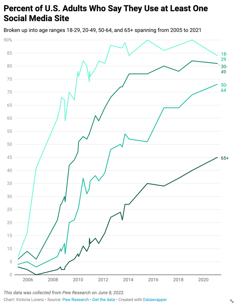
I used a line graph to express trends over time. In this example, I had data for the percent of U.S. adults who say they use at least one social media site from 2005 to 2021. Each line represents an age group and comes closer to the present, moving left to the right. This format makes it easy to see the general trend at a glance.
When initially making this chart, I pasted data from excel that expressed the percentages as decimals, so it did not correctly translate to the line chart at first. I had to go back into the original spreadsheet and retype each decimal as a whole number which left more room for error. Including data about which platforms each age range uses could make the chart more exciting and insightful because each demographic has changed over time. For example, when Facebook was first popular, it was primarily used by college students but is now more prevalent among older people.

The last dataset I visualized reflected the trends of violent crime in America from 2010 to 2020. The three categories represented in the final chart are homicide, robbery, and aggravated assault. To make this, I combined multiple data tables; one about the number of homicides, one about the number of robberies, one about the number of aggravated assaults, and one about the total number of violent crimes.
I omitted the column about the overall number of violent crimes because it made the data difficult to interpret. In a stacked column chart like this, the overall number of violent crimes looked like another category of violent crime. It is imperative to note this because there are more contributors to violent crime than just homicide, robbery, and aggravated assault, but those were the three that I chose to focus on.
This visualization could be more comprehensive by including the other offenses that make up ‘violent crime.’ Individual crimes could also be put into perspective by being represented in relation to the total number of violent crimes.
Visualizing data requires mindfulness and attention to detail. There are a lot of factors at play, and if you’re not careful, you could mislead the audience without even realizing it.
