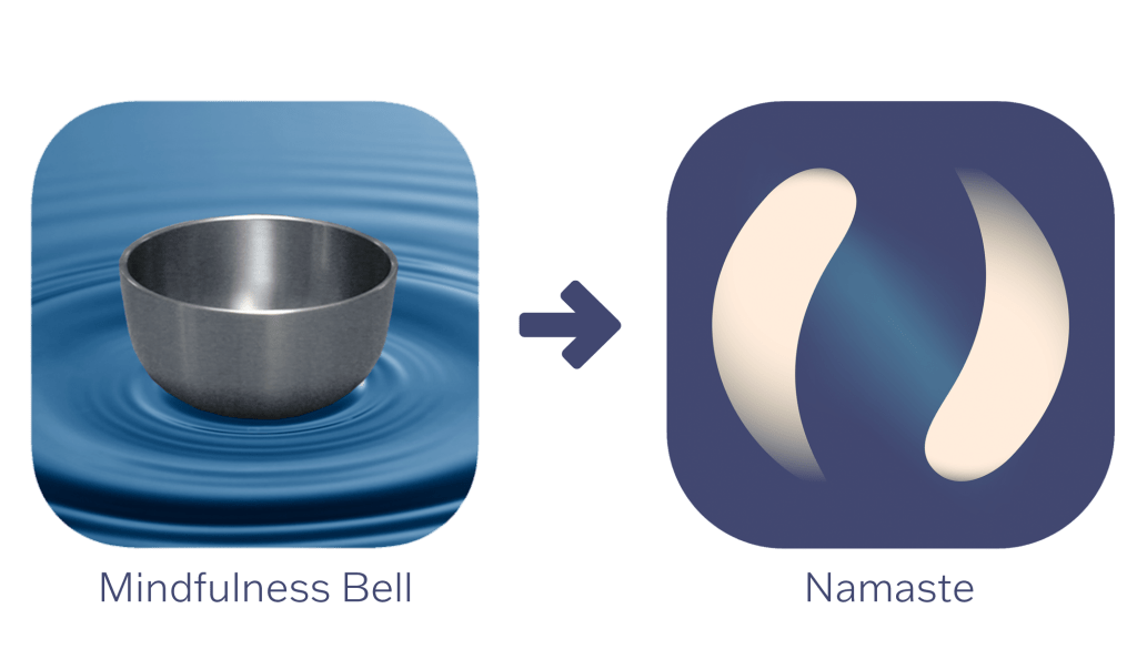
Original logo left, redesign right
Name & Logo
I decided to redesign the app logo because while the original logo makes sense to people familiar with meditation and Tibetan singing bowls, it could confuse others. I also chose to rename the app to make it stand out because many meditation apps use the words “meditation,” “mindfulness,” and “timer” in their name. I chose “Namaste” as the new name because it relates to the eastern origins of meditation, a theme that will guide the app’s development.
I took inspiration from the meaning of namaste when designing the new logo. Namaste literally means “I bow to you,” but as a child, I was taught that it means “the light that shines within me honors the light that also shines within you.” With this in mind, I designed a logo depicting two lights that appear to be following each other in a circle. One represents the app and developers, and the other represents the users. The circular shape is the relationship between the user and the app. They both move each other forward toward growth.
Few people will look at the logo and immediately understand what it represents but it relays the abstractness of meditation and invokes a sense of calm. It is also more inclusive than the stereotypical imagery of a lean woman sitting with her legs crossed and hands resting on her knees.
Typography
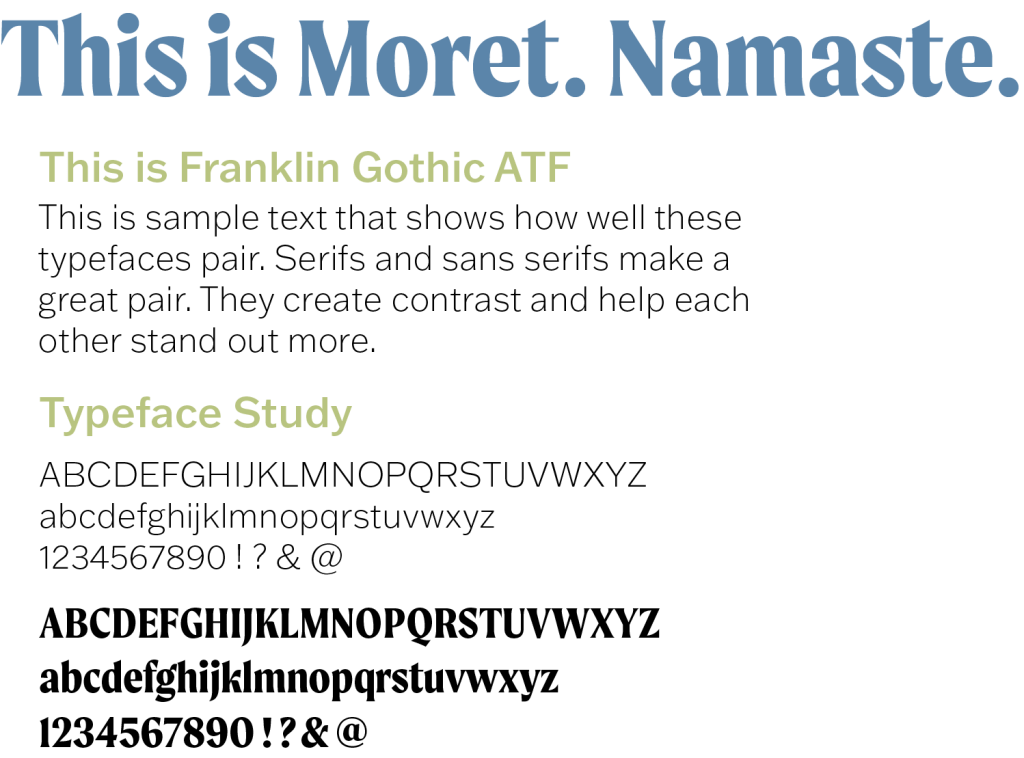
I decided to use Moret as the headline typeface. It has unique qualities like a two-story “a” and “g” and very subtle serifs. These features make it feel refined yet modern which aligns with the goal of the app. I chose Franklin Gothic ATF as the body typeface because the smooth sans serif letters contrast nicely with Moret and are easy to read. Franklin Gothic also comes in a wide variety of weights which will be helpful for creating subheadings.
Colors
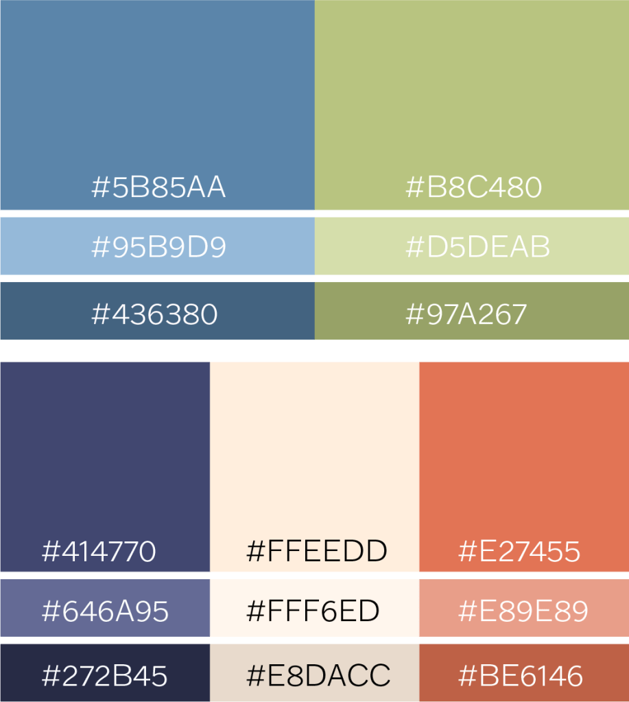
I chose two primary colors and three secondary colors for the app. The primary colors will be used throughout the branding including headlines and buttons. I decided to use blue and green for the primary colors because they are calming and earthy. For the secondary colors I used dark blue, tan, and orange. Together, these colors provide a mix of warm and cool and contrast with each other nicely.
Tone of Voice
I used a similar tone of voice in the brand identity for all three redesigns. They are all based on the language of guided meditation but are variations of the same general concepts. For example, when a typical popup might say “thank you,” Meditation Bell might say, “Namaste,” “may the light shine brightly within us both,” or “may tranquility be with you.”
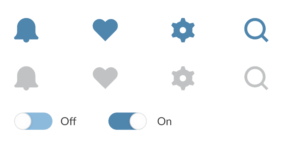
Symbols
I used four examples for the symbol style. The app’s goal is to be as minimalistic as possible, so it likely won’t have a notification bell, but the other symbols will be helpful. I made them the same color as the primary color in each redesign because they should be easy to find but not distracting.
Initial Branding Proposals
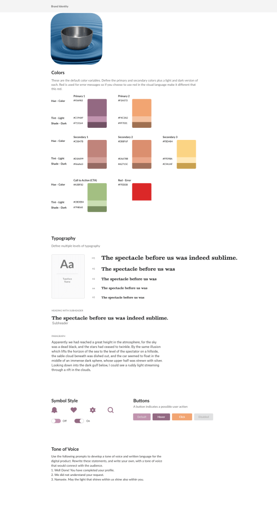
For the first set of redesign options, I used warm, pastel colors to induce a sense of calm. These colors lend themselves to meditation because they are bright without being overwhelming and are easily visible on both light and dark backgrounds. I chose Temeraire for typography because it is a serif with a sense of elegance and is also consistent with the style of serifs that are gaining popularity in pop culture. I paired it with Atlas Grotesk because it is a simple sans serif and easy to read at small point sizes.
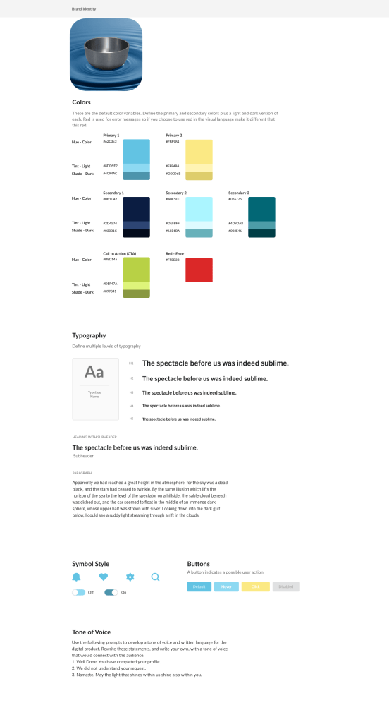
For the second set of redesign options, I primarily used shades of blue because it is most commonly associated with calmness. I also used yellow as an accent color because it often represents sunshine and light. The darker shades of blue present a challenge if the app is used in dark mode because they will likely blend in against a dark background. I chose Trade Gothic for the typeface because it is clear and straightforward.
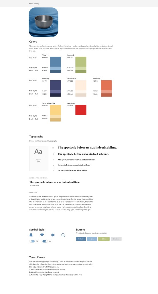
For the third set of redesign options, I used blue and green, which, when used together, typically represent nature. Many people who practice meditation feel connections to nature, making these highly appropriate. For secondary colors, I used a warm color, a neutral color, and a cool color to give me as much variation as possible. I used Mixta Didone as the heading typeface because it, like Temeraire, is an elegant serif in a popular style. I paired it with Franklin Gothic ATF because it is sleek and easy to read at almost any size.
