The surface of a design is the crossroad of the product in terms of functionality and information. The surface is part of the sensory design which arranges elements from the skeleton of the product. Sensory design is the result of combing information about the skeleton with visual design elements.
Surface design is part of sensory design because you must consider the user’s senses when designing it. While all senses may not be engaged, they are still important because they can affect the way a user might expect the product to function.
One of the most important senses to consider is vision. There are many ways to assess how users view your product but one of the most effective is eyetracking. Eyetracking is exactly what it sounds like – it determines where a subject’s eye land on a screen and how they move around it. This data can be helpful in determining layout because people often look for something before, they have time to realize what they are doing similar to muscle memory.
One way to guide the eye where you want it to go is with contrast. Using large point sizes and bright colors in headlines will draw the eye there immediately whereas small text with low contrast in color will be hard to see if the user looks at it at all.
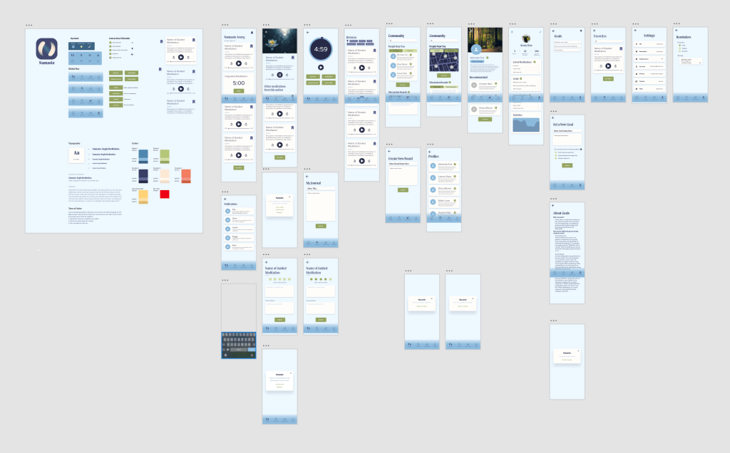
I used these guidelines when designing the surface of Namaste to ensure it would be user friendly and easy to understand. I began by making a UI kit to work from that includes the typefaces, colors, elements, and symbols that the app needs. Doing this creates consistency and, when those elements are made into components, makes editing the surface much easier.
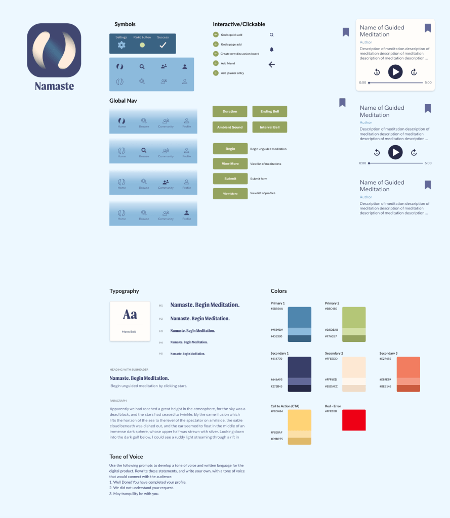
One of the main elements that I designed was the individual meditations. Part of this process was deciding what convention I would use to represent them. I chose cards because they are sleek, modern, add a subtle sense of depth, and make instituting hierarchy very easy. I didn’t want the cards to be too jarring against the light background, so I made them a light color as well. If they weren’t in the card style (perhaps a list instead) they might be hard to see but the slight drop shadow makes them stand out just enough that they are visible without being overwhelming.
Once the typefaces, colors, elements, and symbols were established I started laying them out on the screens and applying color. Initially, I used a dark blue background, but it was too intense for the calming intention of the app. I swapped it out for a light blue, close to white, and used the dark blue for text because it had high contrast. Contrast helps with creating hierarchy as well as visual accessibility.
I refined the surface design until all elements worked well together and created a cohesive app with clear hierarchy making it as user-friendly as possible. It follows conventions such as having a global navigation at the bottom while also including novel features such as the ability to build, set custom goals, and maintain a journal.
 Victoria Lorenz