The skeleton is one of the most foundational layers of design. Jesse James Garrett defines the skeleton as “the placement of buttons, controls, photos, and blocks of text. The skeleton is designed to optimize the arrangement of these elements for the maximum effect and efficiency.” By refining the skeleton, you ensure a more effective final design than one that does not consider the skeleton.
I began this process by creating wireframes. I laid out the app in its most basic forms. The icons are simple, and there are no colors or images. While this may not be visually appealing, it lets designers focus on the skeleton. Once the skeleton is defined, the designer can apply visual design to it; it is more important to have a strong skeleton before detailed visual design.
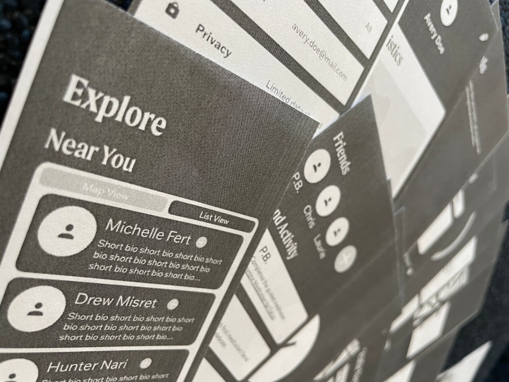
One of the most challenging aspects of the wireframes was defining the global navigation. It was difficult to decide which features should appear there and which could exist within another section. I tried to group things logically, putting as many things into categories as possible to overcome this. These categories became the global navigation.
I made six wireframes based on six user flows. Once the wireframes were complete, I printed them to scale and cut them out. I then recruited two people to be user testers for me. They knew nothing about the app when they began and have no or limited knowledge about design or user testing.
To conduct user testing, I began by briefly explaining what user testing and what I would like the subjects to do. They each had three goals to complete and were given as much time as needed. I was sure to explain to them that nothing they do is wrong because it reflects the design and not their ability.
User testing was far more helpful than I thought it would be. When creating the wireframes, everything made sense to me because I was the one to design them. I understand how I think the app should function. It can be far more challenging to understand for people who have not used it before.
My first test subject, Lianna, had an easy time completing all three of her assigned goals. The most trouble she has was saving a meditation for later. The primary aspect she struggled with was seeing the bookmark button. I used the flag button following standard design convention, but there was not enough contrast, so she could not see it. She later found the same button (that had been filled with a darker color) and was able to complete the goal.
My second test subject, Jewel, had a more difficult time at first. Her first goal was to set reminders to meditate. This is one of the less prominent features of the app and, therefore, more challenging to navigate, especially with no prior interaction with the app. Once she completed the goal, the other two were far more effortless. When we moved on to the next goal, she said, “It seems like I explored the whole app, so I think I might know where to go from here on out.” This reaction shows that after a few minutes of exploring the interface, the user feels confident in their ability to complete a task revenant to the app successfully.
 Victoria Lorenz